Affichage des articles dont le libellé est arrangement. Afficher tous les articles

lundi 7 juillet 2014

Store gallery: The Netherlands’ DekaMarkt returns to its roots


Holland’s oldest grocery chain Dekamarkt has taken its new concept store to market. Retail Week takes a turn around the Haarlem store.


Each area has its own distinct character, but at the same time this is still an integrated whole with a recognisable handwriting.


DekaMarkt, the Netherlands’ oldest grocery chain, has opened a concept store in a former railway carriage factory in Beverwijk, on the outskirts of Haarlem. With a 50,000 sq ft footprint, the ‘World of Food’ is a large store, so to give the interior a more human scale, the decision was made to adopt a market-style approach.
Consultancy Twelve Studio created the blueprint for the store, the principal mid-floor feature of which is a series of pavilions spread across the floor. These are rounded in order to break down the straight edges of the box and are home to specialist areas including fresh counters, coffee roasting, restaurants, sushi, juices and a wine cellar.
Wooden market-style carts and crates are used as display vehicles, reinforcing the sense that this is more than a big box.
What is also interesting is that each area has its own distinct character, but at the same time this is still an integrated whole with a recognisable handwriting. In part, this is achieved by the use of large format bold graphics that act as navigation aids and design features with equal force.
For retailers operating units of this size, there is an ever-present danger of shopper boredom and the feeling that walking round a shop is something of a chore. DekaMarkt seems to have avoided this and has created an interior in which shoppers might just want to slow down and enjoy the way the products have been organised.
It is one of the ironies of retail that markets used to be places that were looked down on and that shoppers went to because things might be cheaper than in a supermarket. Today, however, grocers such as DekaMarkt are falling over themselves to offer interiors that go back to food retail’s roots.
Source: http://goo.gl/q7AA8i

Plus de photos: http://goo.gl/9guWbp

vendredi 21 février 2014

Versatility Rules

Transactional units offer a growing range of services – from deli ordering to blood-pressure monitoring – in a bid for consumers' and retailers' attention.

While in-store kiosks have had a checkered past in grocery retail, leaving a trail of kiosk carcasses across the industry, there are a number of examples of store-based consumer-interface machines that have survived and are delivering value to consumers and merchants.
PEAK CONDITION
SoloHealth's in-store kiosks enable shoppers to assess their overall health.
Generally, the success stories fall under the rubric of "transactional kiosks" where consumers interact with the machine and get some palpable benefits in return: coupons, cash or gift cards in exchange for coins, DVDs, deli orders taken in lieu of waiting in line, or medical information about themselves. Interest in these kiosks is sparking increased competition among their vendors; in the coin-counting arena, for example, market leader Outerwall (formerly Coinstar), based in Bellevue, Wash., is facing a challenge from Mt. Prospect, Ill.-based Cummins Allison, which introduced its Money Machine 2 last year.
Kiosks that offer just product information – recipes, directions to products, nutrition info – haven't fared as well. "Product information kiosks have a novelty effect, and then they flatline," says Juan Perez, president and CEO of Hoffman Estates, Ill.-based ADUSA, which has more than 600 deli-ordering kiosk installations.
Store transactional kiosks are bolstered by a booming culture of self-service, notably at airports, banks and gas stations, as well as at stores themselves with self-checkout lanes. Moreover, consumers have become increasingly enamored of using a portable computer/kiosk – their mobile phones – to handle more and more tasks.
The digital revolution is also beginning to reach into the traditional store kiosk. For example, retailers are extending deli-ordering capabilities to the web and mobile phones, and some have augmented their deli kiosks with iPad tablets that store employees can use to collect orders. Others have employed tablets as the kiosk itself, with fewer technology requirements than a typical kiosk. In addition, some kiosk providers are leveraging the cloud to support in-store kiosks rather than requiring processing power in the store.
Food-ordering kiosks, such as those used to order deli items, continue to be a mainstay of the grocery business. According to the 2013 kiosk study by Franklin, Tenn.-based IHL Group, the number of installed food-ordering kiosks (including those used by fast-food chains) grew 6 percent last year and is expected by grow by that amount each year through 2017.
Randazzo Fresh Market, a Michigan chain with three locations in Macomb Township, Clinton Township and Warren, installed a deli kiosk in each store just before the 2013 holiday season. The kiosks, from ADUSA, come with a queue management module that conflates orders from the kiosk users and from shoppers waiting at the counter into a first-in, first-served arrangement, so that neither party feels underserved.

The queue management module gives me the reassurance that our associates are working efficiently and giving equal attention to counter orders and orders coming from self-ordering devices."
– Sonny Randazzo, Randazzo Fresh Market

"The queue management module gives me the reassurance that our associates are working efficiently and giving equal attention to counter orders and orders coming from self-ordering devices," says Sonny Randazzo, owner of Randazzo Fresh Market. He adds that the functionality in the new kiosk outpaces that of the stores' previous unit, and as a result, "our associates and customers quickly acclimated to it."
A WELL-ORDERED DELI
Deli kiosks, like those offered by ADUSA, streamline the ordering process in the department.
Last year, ADUSA started deploying parts of what it called its Omni-Channel Fresh-Foods (OCFF) strategy. The program encompasses the self-ordering kiosks for all manner of deli items, as well as bakery, meat and seafood; the order-taking tablets; the queue management system; an option of using cloud-based hosting; and a thin-client platform using the Windows Embedded Standard 7 operating system. The queue management system includes a queue manager touchscreen for deli employees, a ticket dispenser for shoppers, and an LCD queue viewer screen that shows shoppers the number being served, the numbers in the queue and the estimated wait time.
ADUSA plans to add online and mobile self-ordering, order management and production management, along with a digital menu board.
Randazzo expects to go live with the deli-ordering tablet in one of his stores, according to Perez. One retailer that has already employed the tablet is Brookhaven Marketplace, which operates three stores in the Chicago suburbs of Mokena, Burr Ridge and Darien. "We intended the tablet to be used like a line buster when there are 30 to 40 people on line at the deli on a busy Saturday," says Perez. But Brookhaven uses it differently at its Mokena location, which also has a standard deli kiosk.
"The store manager walks up and down the aisle," Perez notes. "He knows many of the customers. He asks them if they're getting deli and if he can take their order." Brookhaven recently installed a kiosk in another store and will bring the same tablet to that location, Perez adds.
Perez acknowledges that deli kiosks aren't suited for underachieving delis. "Kiosks do well in delis that are thriving but have problems with long lines such that people are walking away," he explains. Declining to disclose cost figures for his kiosks, he says the average kiosk order is $11 to $12, or about twice the average counter order.
Health Check
Another kiosk type gaining traction in the grocery sphere is the medical kiosk, which allows shoppers to assess vital aspects of their health at no cost. For example, the SoloHealth Station, from Duluth, Ga.-based SoloHealth, measures blood pressure, body mass index and visual acuity, and offers an overall health assessment as well as a list of local doctors. A recently added feature is an Affordable Care Act (Obamacare) education module that offers information on the health insurance exchanges, according to Kioskmarketplace.com.
The SoloHealth Station, which began in 2008 as a vision-only kiosk, is now in almost 3,500 locations, including 700 Safeway and Safeway-affiliated stores, 45 Schnucks locations, 2,200 Walmarts and 563 Sam's Club outlets, according to Bart Foster, founder and CEO of SoloHealth. Many of the kiosks are in stores with a health clinic, but virtually all are in stores with a pharmacy.
"We're getting 30 to 35 uses per day [at the SoloHealth Station], which is pretty good," observes Mike Juergensmeyer, VP of pharmacy at St. Louis-based Schnuck Markets, where blood pressure is the most frequently measured health metric. On average, users spend about four minutes with the kiosk, according to SoloHealth.
The Schnucks kiosks are generally found in the pharmacy department, though they may also be located in the front of the store if room is lacking in the pharmacy, Juergensmeyer explains, adding that Schnucks pays an undisclosed "ongoing cost" for the kiosks.
Juergensmeyer observes that the SoloHeath Stations seem to be used more in stores located in lower-income neighborhoods "underserved by the medical community." That trend holds nationally for the kiosks, says Foster. Across all regions, a small percentage of users load their health information into a personal account, which is hosted in the cloud by SoloHealth, and can be accessed from any computer.
Besides charging retailers, SoloHealth generates revenue by selling video and banner ads that are viewed in the kiosks. The ads can be geared to particular users, based on personal information they provide. "If we know your age, ethnicity and gender, then while you're in the blood-pressure cuff, you can watch a 30-second video specifically for" that category, says Foster. Advertisers include Procter & Gamble, Pfizer and Novartis.
The rationale for a health kiosk, note Juergensmeyer and Foster, is that it can burnish a retailer's service credentials and help maintain a shopper's loyalty. That's a minimum threshold that any successful kiosk implementation would have to cross.

mercredi 12 février 2014

La contribution des différents éléments d'une grande surface alimentaire à la satisfaction du client

L'objectif de cet article est d'appliquer au secteur de la distribution un modèle jusqu'à présent utilisé dans d'autres catégories de services : le modèle Tétraclasse (Llosa, 1996). Les résultats d'une étude empirique montrent que les éléments d'une grande surface alimentaire suivent différentes logiques de contribution à la satisfaction du client. Les facteurs d'ambiance influencent fortement son niveau de satisfaction, quelle que soit leur évaluation. Les critères utilitaires ont, dans leur majorité, un poids fluctuant (fort en cas de défaillance, faible si le critère est jugé positivement) ; les services périphériques ont, pour l'essentiel, une logique de contribution inverse.

Article complet en ligne
http://goo.gl/MZP8gO

vendredi 17 janvier 2014

Le nouveau parcours client des hypers Carrefour

Carrefour a repensé le parcours "shopper" dans ses hypermarchés. L'objectif : relancer la vente des rayons non-alimentaires, en obligeant tout simplement le client à passer devant. Démonstration dans l'hyper breton de Rennes-Alma, réaménagé avant les fêtes. Les photos de Linéaires.
L'idée maîtresse de Carrefour, dans cet hyper de taille moyenne (10 200 m²), est de remettre le bazar permanent dans le flux client. Quitte à rallonger le parcours.
C'est la fin de la large zone non alimentaire, à droite de l'entrée, qui caractérisait les magasins de l'enseigne. Pas question non plus, ici, d'ouvrir une seconde entrée pour un circuit court alimentaire : un autre dogme de Carrefour qui tombe.
L'entrée unique est décalée vers la droite et donne directement sur la beauté. Ce rayon, qui génère du trafic et des achats d'impulsion, devrait empêcher les clients de virer directement sur la gauche en snobant le non-al. Et plusieurs univers ont été déplacés pour être desservis par l'allée centrale : maison, culture, bricolage, etc. Là encore en misant sur les achats d'impulsion.
Sur l'alimentaire, tous les métiers de bouche ont vocation à être valorisés dans une zone marché panoramique. Quant aux PGC, ils sont plus marchands grâce à des allées élargies et des têtes de gondole (en partie) massifiées.
Pour séduire différents types de clientèle, l'hyper rennais multiplie les grands écarts. Il propose aussi bien un stand sushi, un espace bio, qu'un rayon "Courses éco".
L'accueil a également été retravaillé pour être plus agréable, et un nouveau discours, centré sur les attentes des clients, est adopté en caisses.

Pour aller plus loin

Linéaires janvier 2014
A lire dans le numéro de janvier de Linéaires :
- La visite commentée de l'ensemble du magasin
- La nouvelle autonomie laissée aux hypers Carrefour
- Les photos des rayons alimentaires

jeudi 16 janvier 2014

Dutch design week...

Dutch creative agency …,staat has designed the interior and branding for this alternative supermarket in Amsterdam, where ingredients are grouped together as recipes rather than food types (+ slideshow).
Bilder & De Clercq by …,staat
The interior for Bilder & De Clercq  by …,staat  includes a cafe area, which has a counter decorated with handmade turquoise tiles.
Bilder & De Clercq by …,staat
Wooden panels are hung across the ceiling and merge into shelves behind the bar to display bread.
Bilder & De Clercq by …,staat
Sections of the counter are cut out to accommodate freestanding wooden units with glass shelves.
Bilder & De Clercq by …,staat
Instead of traditional supermarket aisles, the store features bespoke white tiered frames with wooden surfaces for displaying food. The steel frames are grouped according to the ingredients of each dish, which is pictured and described above the produce.
Bilder & De Clercq by …,staat
The graphic identity, packaging and kitchenware for Bilder & De Clercq was also designed by  …,staat.
Bilder & De Clercq by …,staat
The black, grey and turquoise colour scheme is applied to take-away coffee cups, printed recipes and store cards.
Bilder & De Clercq by …,staat
The range of kitchenware includes chopping boards, vegetables peelers and spatulas, all of which come in wood or metal.
Bilder & De Clercq by …,staat
The project was shortlisted for Best Interior in the Spatial category at this year's Dutch Design Awards , held as part of Dutch Design Week . The category was won by a wooden staircase inserted into a medieval church.

mercredi 15 janvier 2014

Whole Foods Market store by JGA, Detroit


Whole Foods Market store Detroit Whole Foods Market store by JGA, Detroit
OBJECTIVE: To create a more “city right” concept using local signature icons.
HOW OBJECTIVE WAS ACCOMPLISHED: Whole Foods Market is about local, natural, and socially and environmentally responsible commerce. The Whole Foods Detroit city location lives up to these principles not only in what it purveys, or through the associates in the store, but as well with the environment and building in which it conducts its business. This footprint is more condensed and “city right” relative to the square footage, with its natural, yet “downtown” sensibility. Design partners, local artists and fabricators joined with the Whole Foods team to create a fusion of food and place through reclaiming, repurposing and even reimagining pieces of Detroit’s past into an expression of Detroit’s future.
Whole Foods Market store Detroit 02 Whole Foods Market store by JGA, Detroit
The store features an expanded assortment of prepared and ready-toprepare foods, in conjunction with a broad assortment of fresh and specialty perishables that becomes the “city kitchen” for the young urban resident, neighborhood consumers, and the working population surrounding the store who see it as a place appropriate to their various daytime needs – whether for a healthy lunch, shopping for the evening’s dinner or the week’s groceries.
Whole Foods Market store Detroit 03 Whole Foods Market store by JGA, Detroit
UNIQUE PROJECT CHARACTERISTICS: The environment has key feature areas with an expanded café. They also offer a series of specialty stalls focusing on dairy products and cheeses, produce and specialty foods, along with bakery products, as well as an aggregate area of prepared specialty foods with local-to-international focus. The character of the store creates an instant connection with the shopper in the neighborhood; a neighborhood that represents the past, present and future of urban Detroit and its eclectic, colorful and welcoming message to those looking to contribute to the future of the city.
Whole Foods Market store Detroit 04 Whole Foods Market store by JGA, Detroit
The overall organizing background element used throughout the store is a unique street grid of Detroit influenced by the city’s French roots with radial streets, squares and avenues. This is used in terms of background graphics, cornice treatments, directional signage, etc.
Whole Foods Market store Detroit 05 Whole Foods Market store by JGA, Detroit
Feature elements within the store include:
- Bristle wall “Cooking” graphic constructed of sculpted squares of repurposed broomstick material laser cut into a 3D sculpted graphic
- Specialty Foods features a large panel element with a patchwork of reclaimed signs ranging from street, business and institutions; rescued from the faded scrap to become a colorful, eclectic and locally relevant diary of the areas past.
- A series of metal conduits bent to create a bakery header reminiscent of tail pipes and Detroit’s namesake “The Motor City.”
- Motown 45-LP records become checkout lane markers, reflecting the company’s Motown heritage
- A corrugated metal background for the Cheese Department recognizes the creative and artistic nature of graffiti.
- A heritage timeline brings together highlights of both the city’s history as well as Detroit’s focus on popular culture, history and its ongoing reinvention.
- Reclaimed elements and furniture pieces from the city’s industrial heritage within the café element repurposed as tables, chairs and service elements.

vendredi 10 janvier 2014

Astuce > Pour trouver des plans de magasins !

Je ne sais pas si vous avez trouvé des choses intéressantes avec l'astuce décrite il y a quelques semaines.
Ce matin j'ai testé en n'affichant que des images en noir et blanc.  Et cela me semble assez pertinent.
Voir par exemple
http://goo.gl/BgZLMj
ou http://goo.gl/kqVWk1

mardi 17 décembre 2013

Two inspired New York retail concepts you’ll wish you’d thought of

Few things upset me more than walking through a shopping precinct and seeing ugly, empty store fronts with 'To Lease”'signs hanging (typically quite poorly with duct tape) in them.
Retail is a shifting landscape but I’ve often thought there must be a better way to use these underutilised spaces and keep a sense of vibrancy and sense of community alive and well. Why not make the space shoppable until a permanent tenant moves in?
The bottom end of Newmarket has been languishing for some time and Parnell has also undulated in and out of this phase.  Perhaps it’s time to take a leaf out of Westfield’s portfolio and create hoardings which lead us to believe something new and exciting will be coming soon. The window frontage could be leased to hold shoppable decals (a la Tesco Korea’s underground shopping wall), disrupting the landscape in an engaging and relevant way.
Innovative shopping experiences can be created in any store front and we see the occasional examples of well thought through use of space, such as Sportsgirl grabbing some attention by smartly using  their store exterior as a QR empowered portal while they refurbished.
But these examples pale when compared to some projects in New York City which are breathing life into empty spaces. The injection of innovation, vitality and dream-making potential brings happy tears to my hardened shopaholic eyes.
Shape-shifting storefronts 
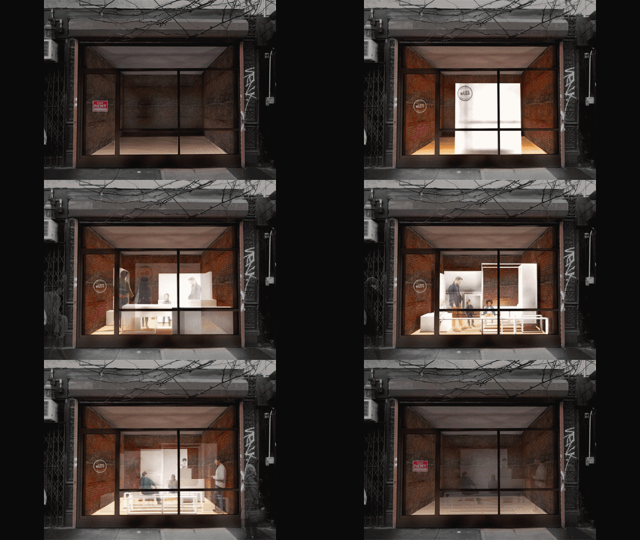
Vacant storefronts in an evolving precinct do little to create excitement and anticipation, even more so when there are 200 empty, as in the Lower East Side.   Enter a smart bugger who believed the empty stores could be utilised for the benefit of the community and emerging businesses.
miLES (Made in the Lower East Side) created a Store Transformer that can change any store front into a vibrant pop-up community hub. Spaces literally evolve from a shared working space to a snack bar, trendy boutique to class room in a matter of weeks.
Eye opening and inspiring.
Step into the Story
Now let’s venture to 144 Tenth Ave (at 19th Street) in Manhattan’s Chelsea district where Story is redefining the shopping experience by developing a store which undergoes complete reinvention every 4-6 weeks. The innovators responsible for this stroke of genius sum up their idea like this: “STORY has the point of view of a magazine, changes like a gallery and sells things like a store.”  I’m already hooked.
Offering an immersive, 360-degree experience, Story is pioneering a new way to shop and experience brands. Transactional storytelling with a fresh crop of merchandise every month captures your attention through experience, entertainment, surprise and delight. Delight by the bucket load.
Themes have included Love, Colour, His, New York, Wellness and, should you be lucky enough to be visiting NYC any time soon, the current story is Home for the Holidays.
Story is a physical manifestation of content storytelling and transaction retailing.  In other words, a thing of beauty and wonder.
Retail with heart
Retailers in this hemisphere need to imagine bricks and mortar stores that are new, vibrant and exciting because as shoppers we yearn for something different, we are desperately seeking to fall in love with a new retail experience.
 The New York concepts recognise the part that retail plays in our personal and community landscapes; the something that individual shoppers want as part of “my network”.
Local industry and emerging businesses also benefit when spaces can be shared in a way that fosters growth and collaboration.
I envy the foresight and creative minds of these entrepreneurial Manhattanites but I’m confident of hatching a plan to drink in these retail experiences in person again next year. 
And if Santa drops some flights into my stocking this Christmas, start spreading the news. I’m leaving today. I want to be a part of it….
Juanita Neville-Te Rito is chief executive of Hotfoot and blogs atretailgeek.co.nz

vendredi 13 décembre 2013

Pour trouver des images d'organisation de supermarchés!

Avez-vous déjà essayé une recherche d'images sur les mots clés suivants?
layout supermarket design

A mon avis, vous devriez trouver des choses intéressantes.
Pour tester, suivez ce lien
http://goo.gl/cYyYjJ ?

jeudi 28 novembre 2013

Supermarket Layout And Visibility Of Retail Brands

As you approach the behemoth that is your local supermarket, grab a trolley, and look up your list on your phone, do you ever wonder why you never stick to that list? It’s not a sign of weakness; supermarkets are specifically designed to squeeze as much money out of you as possible, and uses a series of psychological tricks using its layout.
Imagine a typical shopping list for a midweek shop for your ‘bits’. Bread, milk, cereal, maybe some lettuce for your lunchtime sandwich? Easy enough to stick to, right? Well, supermarkets are determined to distract you enough for you to overspend on food you don’t need.
Many larger supermarkets now have barriers set up behind the entrance, so there is literally no turning back. The only way to exit is through the checkouts, forcing you to walk past tempting products. The entrance is the most important part of the supermarket, and most are keen to make a good first impression. It’s here where you’ll find floral stands, hot baked goods and fresh fruit and vegetables. All of these are chosen to positively assault the senses. Pleasurable sights and smells will give the customer a feeling of optimism as they start their shop. But also note: all of these products also have very high profit margins!Putting these products at the bottom of your trolley at the start of your shop also makes little sense, as they’re all delicate and will be crushed by canned goods later!
If you’re just popping in to get bread and milk, you’re out of luck. These two classic essentials, alongside other everyday products, are usually stored in the back of the supermarket, forcing the customer to walk past rows of other products. This means you’re exposed to as many products as possible before you get to what you actually need.
Once you’ve reached the milk, you, like most other customers will walk the perimeter of the layout and dip in and out of the aisles depending on what you might need. This is where ‘gondolas’ come into play. These are the reserved sections at the end of the aisle where the special offers usually are. Big brands have been known to spend up to £1 million for a gondola placement on one of the ‘big four’ supermarkets. However, a new trick supermarkets use to boost sales is to simply place the products there, surrounded with red and yellow stickers but with no actual offers. This technique makes a profit because of our established psychological connection between the end of the aisle and a good bargain.
Once you’re in the aisle, note how supermarkets have now applied their own classification system to shelves. Generic or store brands are always on the bottom shelf. Big brands are on the middle shelf, or ‘eye’ level, where our eyes will usually rest. Luxury or more expensive brands will lie on the top shelf. The psychology behind this placement is that bargain or quality hunters will go out of their way, but the average hurried shopper will grab what is in front of them.
Another popular supermarket method is the special ‘celebration’ display that puts together all the products you’ll need for a certain event. There seems to be something every month, and supermarkets have started to grab at straws to create events in our mind in order to sell party goodies, it’s now common to see special stands for TV show finales, Football tournaments, and the mythical ‘Barbeque Summer’. These displays are designed to encourage you to buy more because everything feels like a ‘perfect accompaniment’ to something else, causing a spending chain reaction.
Supermarkets are also huge fans of colour psychology. Reds inspire feelings of urgency and so is the colour of sales – ‘grab this before it’s too late!’ Blue inspires trust and a feeling of reliability – hence a ‘blue cross sale’. Purple denotes luxury and royalty, and is used to decorate sections that sell high quality food.
If you’re feeling stressed out from all of these tricks and fancy a glass of Merlot from the wine aisle, you’ll notice how aisles that sell alcohol are designed slightly differently to the rest of the store. More recently built stores have started to turn the wine aisle into a little oasis of calm, using wooden floors, grape vine decorations and mellow colours and lighting. These are all techniques used to put you in the mood for an alcohol purchase.
The till is where the big bucks are made. The English are famously tolerant of queues, but this has ebbed in recent decades as our lives become busier and now most of us want to leave as soon as possible. This distress leads us to buying just a little extra – and thankfully the mini aisles by the till provide us with plenty of sugary treats!
The strangest element of supermarket psychology is that most of us know that we’re being duped, and we’re all perfectly aware that the £2.99 piece of beef is essentially a £3 piece of beef. Yet we still fall for every trick, like willing subjects.As the power of the supermarket spreads, they will always be concocting new ways to push their products, old and new.
Tips for the Small Business Owner
  1. Product Location – Where are you placing your most important products in your store or on your website? Are the most popular products with the highest profit margins the easiest to find?
  2. Price isn’t everything – Just like in the supermarkets, most people buy the more expensive branded goods even though there are cheaper alternatives.Most people’s purchasing decisions are not motivated by price when you effectively sell value.
  3. What else can you sell? A minuscule proportion of people who walk into a supermarket only buy one item. Think about what else you can sell your customer. What else might they be looking for when they visit your store or website?
  4. Discounts – Supermarkets usually run discounts to get people in the door.Can you discount one item to bring people to the store, then upsell something else whilst they are there? If done in a strategic manner, discounts don’t have to hurt your profit margins if they lead to sales of other, full-priced items.
  5. Event Marketing – Like the “celebration” displays used by supermarkets, can you latch on to any local or national events in your marketing? Can you offer a package or put together a special promotion based on the theme of a holiday like Halloween or Thanksgiving?
Rob is a writer who works alongside http://www.design4retail.co.uk/  . He is a self-confessed marketing geek who writes on a range of subjects that interest him such as merchandising, the retail economy and store design.

jeudi 31 octobre 2013

5 steps to personalize the in-store experience

The instance a shopper encounters a product at retail is sometimes called the "moment of truth." But the action the shopper makes at that moment can lead in a number of different directions.
Both McKinsey and Company and Harvard Business Review have attempted to describe the new path to purchase. McKinsey and Company uses a looping model to illustrate a circular journey with four phases: initial consideration, active evaluation, moment of purchase, and post-purchase experience. One brand marketer has even likened the path to a pretzel instead of a loop.
The Harvard Business Review blog describes the buying process as both continuous and intermittent and identifies six key states in which a consumer with mobile capability can exist.
A study by Compete identified multiple paths to purchase involving anywhere from 3 to 35 steps. One wonders what shape the path with 35 steps would be.
Whatever the path, consideration of the customer journey is a preamble to effective execution. We've identified five steps that can help those involved in retail merchandising plan for a more customer-driven experience:
1. Evaluate the effectiveness of current in-store displays
Are your displays truly differentiating for your brand? Do they take into account customers' varied paths to purchase? Do they serve as a call to action to connect to other digital assets that impact the point of decision or post-purchase communication?
2. Research new display options
The range of displays and interactive merchandising is always evolving. The availability of floorstands and counter units with iPads and other kinds of streamlined touchscreens has given rise to new category-specific or promotional uses for interactive merchandising. Kiosks and digital signage can combine to create persuasive interactive experiences.
3. Learn from the success of others
Look to leaders like Macy's and Target who have already invested in understanding the kinds of experiences that will draw shoppers to stores with doors and keep them engaged. Look to innovators; there are products that have traditionally been behind counters that can benefit from in-store merchandising that allows customers to touch and feel products.
4. Understand how to evaluate an in-store merchandising provider
Retailers need a qualified provider that understands retail, their consumer and the cycle and timeline of how a merchandising display program should work. They need a partner that can help them evaluate new technologies. Knowing what questions to ask in the evaluation process will lead to the right partnership.
5. Decide how you will implement and evaluate your new display strategy
A realistic budget and a timeline are critical to success. A timeline that takes into account set store dates for installation and deployment can establish a solid foundation. Determining what the test phase and full rollout will look like will obviously impact the progression of a project. Tracking the project on a continuous basis once it has been deployed will help evaluate success.
David Anzia has been with Frank Mayer and Associates for more than 20 years. FMA specializes in retail merchandising displays and interactive kiosks.

mercredi 30 octobre 2013

Fresh Summit 2013: Taking Displays to Another Level

The produce department at Breaux Mart’s Magazine Street location is only 1,200 square feet, but the retailer makes the space count. Breaux Mart places detailed satellite displays around the department — each carefully composed.
What really made these displays stand out during the Fresh Summit Retail Produce Tour is their use of different textures and heights. Check out a few displays:

This display incorporates a small, colorful bucket of avocadoes on the side and boxes of produce on the bottom. The store merchandises different types of tomatoes to the left and right of the large display in small clamshell and bag containers.

Here, Breaux Mart uses the floor to merchandise the pumpkins, piles the potatoes on a slanted table and puts two small bucket displays on the side. This mixed presentation makes the products more interesting to look at than if they were placed on a flat table.

Breaux Mart also takes a multi level approach in the floral department (see left). A variety of plants sit on risers with Halloween theme products on a shelf above.


Read More: http://supermarketnews.com/blog/fresh-summit-2013-taking-displays-another-level#ixzz2j8PIqD3I

jeudi 24 octobre 2013

How to use food in store displays

Are you thinking of incorporating food into your store's interior design, but want to avoid making your shop look like a toy kitchen set? Here are some tips for tastefully adding some flavor to yourstore displays with artificial food:
Keep things natural
When it comes to food replications, a little bit can go a long way. Instead of purchasing a whole orchard of artificial apples, select just a few items and place them on a divided display tray or similar feature. Depending on your store's theme and atmosphere, you may want to look for pieces that are more realistic and will give customers a sense of relatability. A few pears set naturally in a kitchen display, for instance, could offer patrons a feeling of being in a real home instead of a store exhibit. Food items that are lifelike can be particularly appealing when used with earthy display fixtures, such as carved wooden bowls or baskets. 
Spice it up
For more artistic boutiques, vintage designs and quirky spaces, look for decorations that mimic the appearance of food but have a more sophisticated appeal. Glass or shimmering pieces can add sparkle and catch customer's attention, and can be selected based on your store's design. If you have utilized glittery or rhinestone decals, for example, you may want food items to be equally whimsical. A sleek interior could be paired with items of a more neutral material and shade.
Make a sale
Want to pitch an item without using any words? Let food do the talking by incorporating items directly into a storefront window arrangements. While this is obviously an effective method for bakeries and other food sellers, saving the time otherwise needed to replenish fresh items in displays every day, food doesn't have to be your product to help make a sale. Artificial food can be used as an accent to emphasize your merchandise's utility or just to catch a customer's eye. Creatively intersperse items like fake cupcakes on tall,tiered standing shelving units or a decorative display table.
Stay authentic
Although temporary in their lifespan, using real food in exhibits is certainly still an option. Particularly during autumn, look for seasonal items such as pumpkins, gourds or calico corn. These resilient foods can stay in arrangement for an extended period of time before they begin to go bad, and will mesh perfectly with seasonal sales and themed displays.