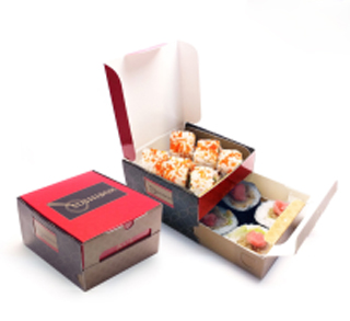
Double-Drawer Box
Since the days of the fish-and-chips wrapped in old newspapers and the Chinese food scooped into unappealing plastic trays, quite some has change. And the developments are continuing, as take-away or take-out meals are the big trend in these years of disciplining our personal financial resources. Note: For the sake of diversity on my blog I decided to write between part 02 and 03 of the Overview of Dispensing Caps, about Take-Away Packaging. Don’t worry, after this article I will post part 03 of the dispensing caps. Traditionally supermarkets and convenience stores have expanded their foodservice platform and built upon consumer desire for convenient and quality ready-to-eat meals. But a recent market survey conducted by Technomic concluded that consumers are sourcing prepared meals from a wider range of retail foodservice operations than they were two years ago, many times at the expense of restaurants. Eating-out is transformed into taking-out. Consumers increasingly choose take-out as a faster, more convenient and often less expensive foodservice option. The survey by Technomic revealed that 57% of consumers now order take-out at least once a week, compared to just 49% of consumers polled just three years ago.
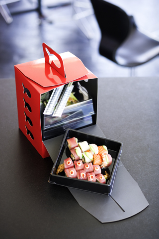
Sticks’n'Sushi take-out box
To keep sales afloat, many restaurants turned to the take-out sector for new revenue streams. An influx of take-home meals from both chain and independent restaurant brands has hit the market place. These value-driven, quasi gourmet-meals help offset lagging restaurant sales, but, of course, all under one condition. The ‘gourmet-meal’ has to be packed in a packaging at a same level as the gourmet-meal itself. I am not talking here about the packaging for junk-food from the fast-food restaurants, nor the (industrially) prepared meals to put into a microwave. I want to highlight the possibilities of packaging for hand-crafted take-away gourmet-meals offered by delicatessen shops and restaurants, which as an alternative to eating-out, supply a quality meal to take home and enjoy. As said the era of food wrapped in old newspapers and scooped into cheap plastic trays doesn’t fit in this market segment. Quality and gourmet are the keywords and consequently the packaging has to transmit these keywords. At the other hand the junk-food or fast-food sector has long year experience with packaging its products for take-out, unattractive as the packaging might be.
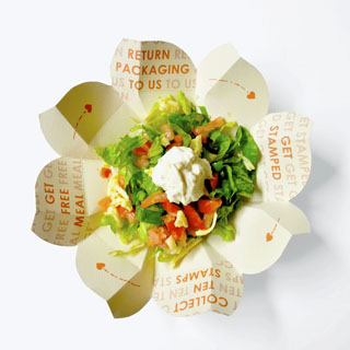
Guatruck lunch box
Asian food is one of the most popular dishes with an extensive expertise in take-out packaging. And I must say with quite some creativity. Their dishes in itself are beautifully arranged and even sometimes a work of art and they understand that the packaging has to be at a similar level. For this article I made a round-trip through some Asian countries and collected the most interesting designs.Not all examples I present here are specifically for take-out food, but they have a design and construction which easily could be adapted for this purpose. I just want to give some ideas. Some years ago I wrote about a packaging with a Danish design for take-out Japanese sushi. It still is one of my favourites, so we start with a repeat.
Sushi with Danish design
Sushi, the famous Japanese dish from decorative fresh fish products, has not only to be superb of taste, but it has to be much more. It has to appeal as much to the eye as to the palate. It has to be fresh, perfect of taste and please the eye.In other words the packaging complements the perfection. “Sticks ‘n’ Sushi”, a restaurant in Copenhagen, packs its dishes in decorative black trays, stackable in the take-away package made from high quality white paperboard. The design is from Pais Design and the material is converted by Jens Johanson A/S both in Denmark. The paperboard material is Frövi White from Korsnäs with a coated white reverse side. As the total surface of the reverse side is printed in black the white coating of the paperboard gives it even a deeper black. The packaging comes in four dimensions. The largest one is made from 410 gr/m2 and can handle a weight up till 3 kg.
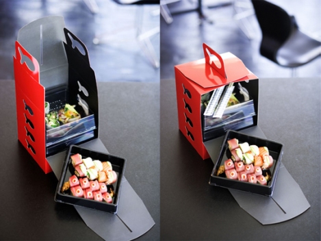
The fish cut-outs on the handle and stackability of the thermoformed trays are in harmonious symbiosis with the product. The extra creasing in the side of the box makes it easy to insert and remove the tray of sushi. The black interior of the packaging as well as the black tray are perfectly showing off the colourful sushi.
Indonesia – Sta-pack (Stacking Packaging) ;
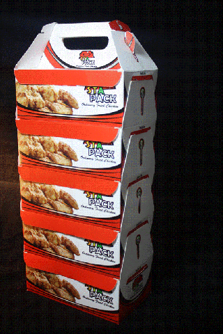

In the same style as the Danish design is the Sta-Pack created by PT Bukit Muria Jaya/BMJ in Indonesia. Not quite the same, as the Sta-Pack consists of several separate units with an added handle. It certainly is a nice and elegant solution as fast food packaging, especially for the take-away market of upscale meals.Stapack has unique characteristics. It adopted and modified the characteristics of the Tupperware elements and applied them to paperboard that can easily be folded saving storage space. In other words a stack of nested Sta-Pack can sit on the counter of a delicatessen shop and filled upon request. Each unit can hold a separate dish and only needs one handle for lifting as the wings of the individual boxes are closed until they locks. fter which it is ready to be taken-out.
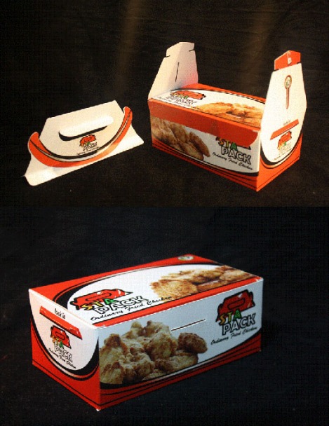
The Sta-Pack is made from food grade CDWB 230 gr/m2 and designed by Irvan Hermawan and M. Aidil Saputra.
Indonesia – Double-Drawer Box ;


We stay with the Japanese kitchen, but now in Indonesia. In Indonesia, (fast-food) take-out Japanese dishes generally are packed in Styrofoam-based packaging. Like Chinese take-out food every box or tray holds one selection of the Japanese meal, such as sushi, bento, sukiyaki, maki, etc. PT. Bentoel Prima created a Double-Drawer box, more or less in the same style as the Danish sushi packaging. It is a paper-based packaging made from printed ivory paperboard of 260 gr/m2 and water based varnished.
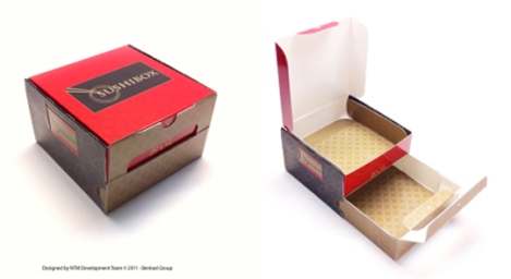
The dimensions of the packaging are 12x12x7.5cm. The packaging is designed by NTM Development Team.
Singapore – Rice Dumpling Box ;
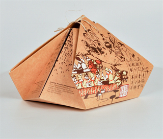

I wrote about this packaging in a previous article, not long ago, but it is such a beautiful construction that it can easily be adapted to take-out meals. Originally the Rice Dumpling Box was created by Starlite Printers (Far East) Pte in Singapore to celebrate the Dragon Boat Festival, otherwise also known as the Rice Dumpling Festival or the Duanwu Jie that falls on the 5th day of the 5th month in the Chinese Lunar calendar. The box is designed to resemble a rice dumpling, complete with a string. At the same time, its design also brings back memories as the packaging is printed on uncoated kraft simulating paper bags that were used commonly in the seventies and eighties. In addition the packaging also instils the value of conserving traditions. The graphics design of the box shows activities relating to the festival such as dragon boat racing and the making of rice dumplings. The box is able to pack six small rice dumplings.This product is made with solid unbleached sulphate paperboard. The printing is done on the uncoated kraft surface to give the box a nostalgic look, the colour scheme used had also been limited to black as the dominating colour to simulate the nostalgic look of paper bags. The package is fastened with a string just like a rice dumpling, the string also serves as a handle.
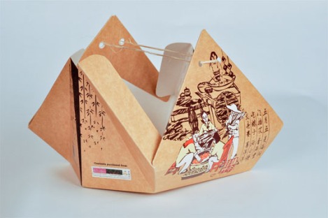
By releasing the string and stretching the side of the packaging, its content can be accessed freely. As the packaging is not enclosed fully, it allows air exchange which is important to maintain freshness of the rice dumpling. The inner surface of the box is laminated with a layer of OPP film to prevent the seepage of oil from the rice dumpling into the board thereby allowing the packaging to maintain a clean look.
Philippines – Sustainable Origami-Inspired Food Box ;


Often a proper prepared take-out meal has a side-dish. Dump it in an unattractive plastic tray or do it as the Filipinos do. You don’t believe this story, but it’s true. In August 2011,Guactruck positioned its design-focused mobile food truck in Manila serving Mexican inspired Filipino rice dishes. Junk-food? The owners wanted the packaging design to focus on creativity and aesthetics, as well as highlight the environmental aspect commonly associated with packaging. Not quite what you expect from the fast-food sector. They came up with a food packaging that incorporates sustainability in three ways. Using only one piece of paperboard, the simple origami inspired design resembles a bud blossoming into a flower. The material they used is paper, no glue or plastic, making it biodegradable and easier to recycle.
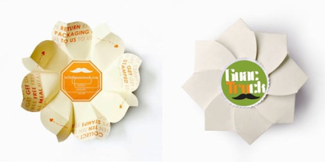
And thirdly they believed that they are responsible for everything that comes out of their truck, may it be waste, food or packaging. Therefore, they highly encourage their customers to return the packaging with the incentive of obtaining a free meal in exchange for ten returned packages. The returned packaging will then be sent to the proper channels for recycling. This way, they created not only awareness on the issue of sustainable packaging and recycling, but also cultivated a habit of conscious and conscientious consumerism. An amazing fast-food packaging of high quality and worth following the lead.
So, that was a quick visit to some Asian countries.
Source: EcoPoint (http://goo.gl/xLcP9m)
Aucun commentaire:
Enregistrer un commentaire