Dutch creative agency …,staat has designed the interior and branding for this alternative supermarket in Amsterdam, where ingredients are grouped together as recipes rather than food types (+ slideshow).
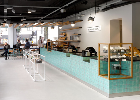
The interior for Bilder & De Clercq by …,staat includes a cafe area, which has a counter decorated with handmade turquoise tiles.
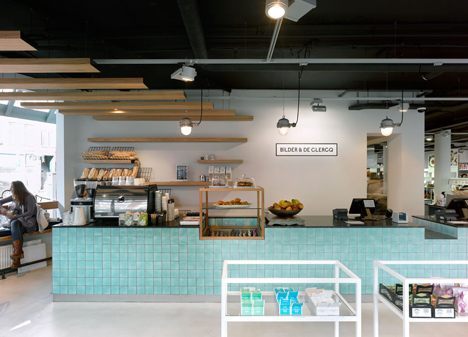
Wooden panels are hung across the ceiling and merge into shelves behind the bar to display bread.
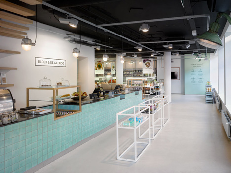
Sections of the counter are cut out to accommodate freestanding wooden units with glass shelves.
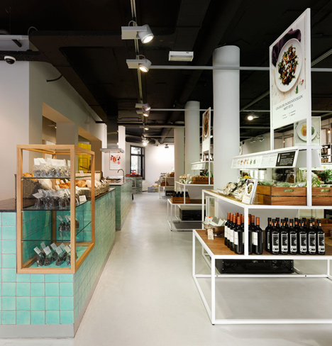
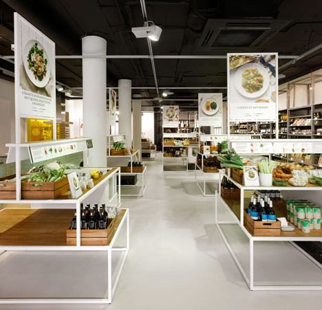
Instead of traditional supermarket aisles, the store features bespoke white tiered frames with wooden surfaces for displaying food. The steel frames are grouped according to the ingredients of each dish, which is pictured and described above the produce.
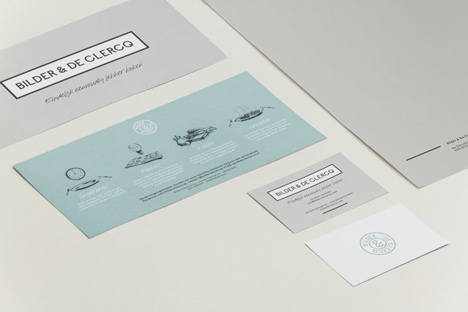
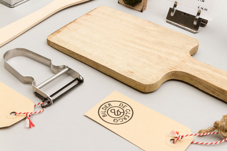
The graphic identity, packaging and kitchenware for Bilder & De Clercq was also designed by …,staat.
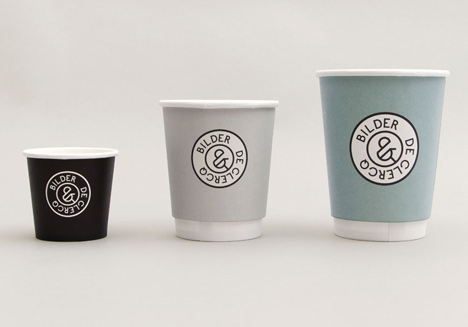
The black, grey and turquoise colour scheme is applied to take-away coffee cups, printed recipes and store cards.
The range of kitchenware includes chopping boards, vegetables peelers and spatulas, all of which come in wood or metal.
The project was shortlisted for Best Interior in the Spatial category at this year's Dutch Design Awards , held as part of Dutch Design Week . The category was won by a wooden staircase inserted into a medieval church.
Source: http://goo.gl/0Unpsu
Aucun commentaire:
Enregistrer un commentaire